Smart Home Application

Android & iOS Mobile Phone

Human Interface Guidelines & Material Design

Concept of an easy to use smart home app with focus on the differences between iOS and Android operating systems.

My Role: UX/UI Designer

The techniques and tools I use include:

  • Workflow Analysis
  • User flow diagram
  • Material design
  • Human interface guidelines
  • Mobile gestures
  • UI and Usability focus
  • Figma
  • Photoshop
Yeah Smart! But Easy?

Smart devices are increasingly part of our everyday lives. These devices are getting better and better and smart home apps are getting easyer, but not simpel enough.

Problems:(

Smart devices are also only as good as their controls
(Key role for user experience)

Forward back and up and down and the same again, is a great thing but only in aerobics class.
(Waste of time)

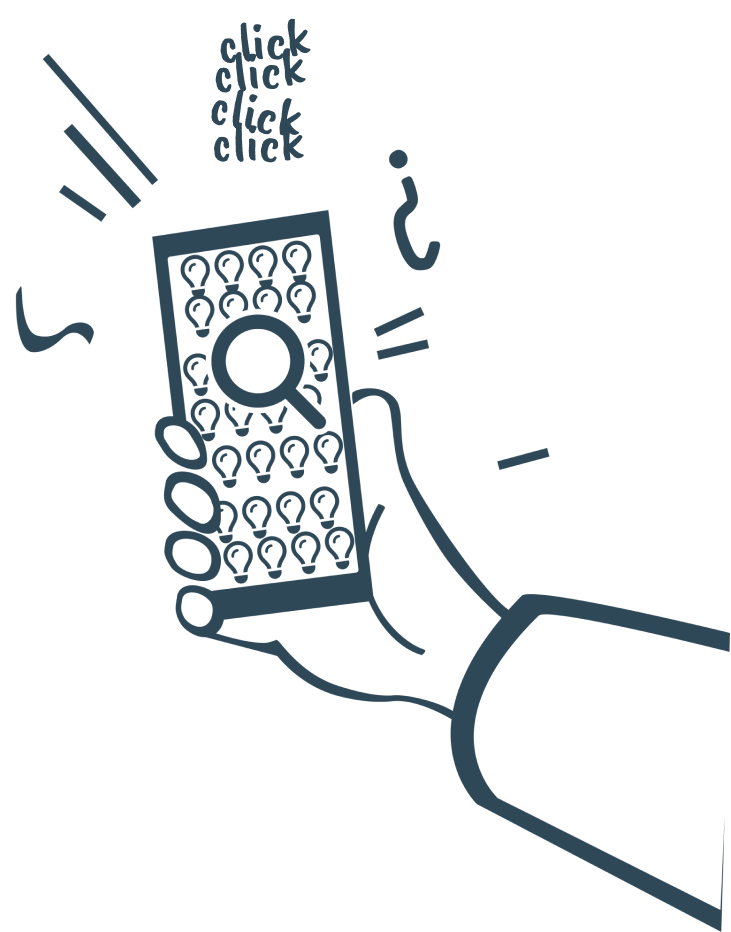
It’s all too easy to get lost in the forest of smart devices because you can’t see the forest for the trees.
(Clutter)

Do you need Zigbee? No thanks one beer is enough.
(Knowledge)

Despite the smart home being set up, you get up to press the light switch on the wall.
(The path of least resistance)

“Hey Google, all lights off” Ok Google ALL LIGHTS OFF !!!! ….. even the ceiling light!”
(Integration/Compatibility)

Same Same But Diffrent

Same function, same goal but still differences in operation and habit.

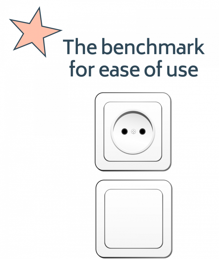
From the socket comes power you plug the plug in to get power but one must turn the plug, the other it does not matter how he plugged him.

If you think about how long you try to plug a 3-pin plug into the socket with two holes until you notice it because you are used to it differently, you can already guess the frustration that can arise.

Solution:)

It must be simple quite clear. Simple to install devices, simple to understand and above all simple to use.

First of all, the solution sounds quite simple.

But any simple and fluid interaction between human and electronic device requires:

The intuitive understanding of what you see and the translation into a function you can interact with.

And interacting even with familiar and expected behavior. Intuitive and self-explanatory.

The Great News

There are not 16 types of connectors whose differences you have to know, in this case there are 2 operating systems. Apple’s iOS and Google’s Android should be closely examined and known.

Diffrences Between iOS & Android

Primary Navigation

iOS: Navigation bar with title, primary action and back functionality in the top right corner.

Android: Built in back functionality in the Bottom Navigation Bar. Hamburger menu in the top right corner. Floating action button for primary action.

Default Typographie

iOS: San Francisco / Android: Roboto

Tabs for Navigation

iOS: Segmented button bar, instaed of tabs.

Android: The tabs are shown in the form of writing, without any other borders.

Cards

iOS: Cards are flat and with rounded edges.

Android: Use shadows for separation and show mostly sharp edges.

Input Fields

iOS: The buttons on iOS have a flat design without shading and are mostly blue.

Android: Android uses different variants, with and without shadows and with motion effects during operation.

Switch

iOS: Uses a specific human interface UI for switch buttons. The switch is located inside the container.

Android: Here the switch button is on the container and is also material specific.

Buttons

iOS: The buttons on iOS have a flat design without shading and are mostly blue.

Android: Android uses different variants, with and without shadows and with motion effects during operation.

Call to Action

iOS: The CTA Buttons are on top, left and right on top by the header.

Android: Android provides buttons for that function. The buttons could include shadows.

Menu

iOS: Human Interface guidelines describe that you should always see from where you come and where you can go and therefore does not recommend a hamburger menu.

Android: Material uses as default a hamburger menu always in the upper right corner or in the tab bar.

Menu List

iOS: Human Interface guidelines uses a different ui and rules like Material.

Android: Material and iOS Menu listen differ from the design.

Design Patterns

Gathering Input

Gahtering input is a design pattern category that includes everything where user enters information.

Data Management

This category generally affects any portion of an app that includes lists of information or files. For example: photo galleries, friend lists, or contact books are likely to include data management patterns.

Navigation

Navigation is intuitive, users are guided through the button bar and other elements, such as arrows at the top.

Social

Social patterns are those which involve interactions between users such as connecting and communicating between friends, reacting (e.g., liking), following, sharing images/articles/statuses and more.

Miscellaneous

This includes patterns that do not fall into any other category. Some examples are achievements, shopping carts, coupons, pricing, etc.

Final steps before creating the interface design

Knowing the main differences between the two mobile operating systems, you can start developing native apps.

Learning from others

But before you start designing the interface, you should take a look at how other apps solve problems. In doing so, you can learn something, both positive and negative, and possibly apply it to your own design or avoid mistakes in advance.

User Story Flow Diagram

Logo

Mobile Gestures

The Final Product

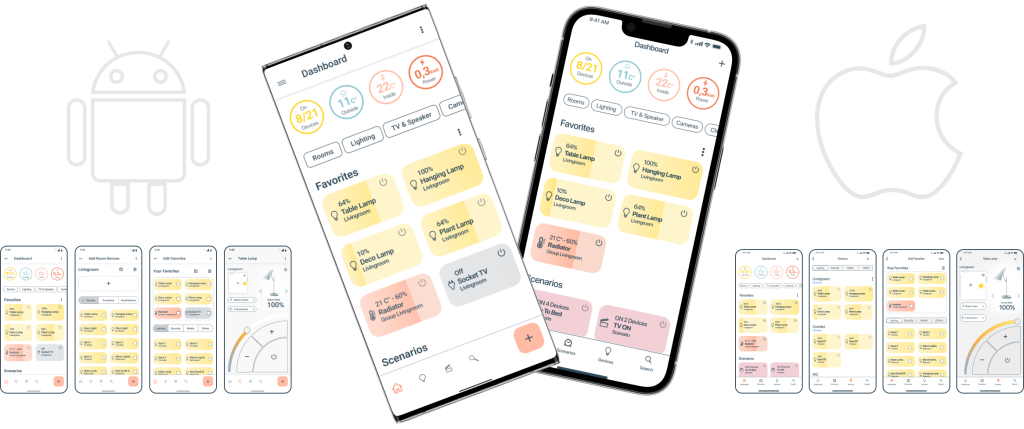
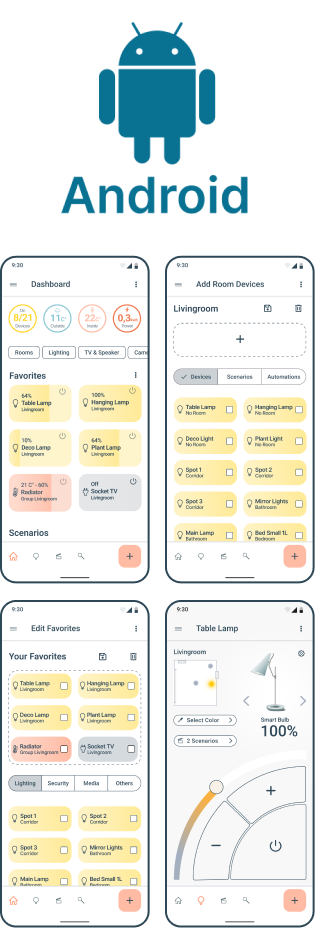
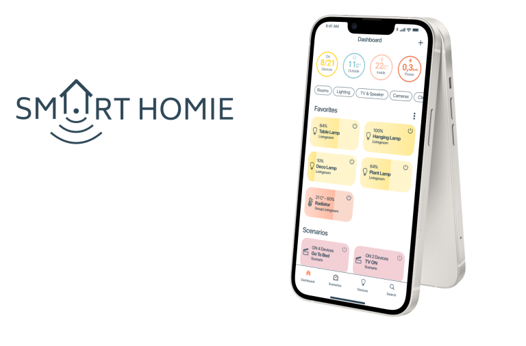
With the goal to develop a clear and unambiguous interface and the collected knowledge I designed native apps for Android and iOS to achieve the best possible and familiar usability on the different systems.

The Final Product

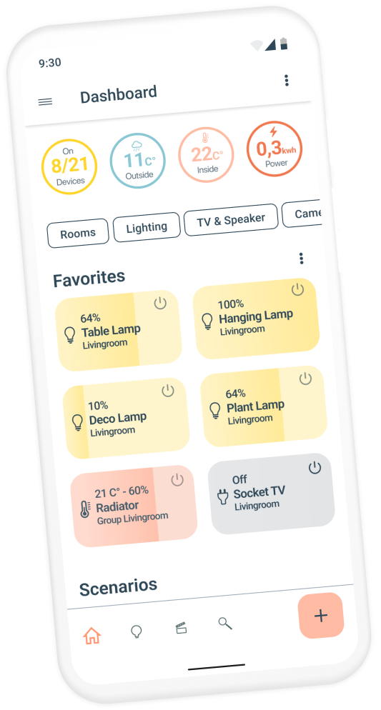
  • Info circles with information like outside and inside temperature and power consumption
  • Chip buttons to reach all important areas with one click
  • Devices are clearly displayed as cards and can be switched on and off. The lamps can be dimmed by swiping over the device card.

Device Details

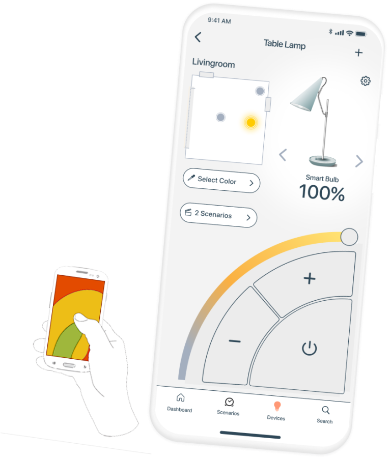
  • Clearly structured interface with components whose function is easy to recognize.
  • Extra large control element in the optimal area for one-handed operation (mirrorable for left-handers)
  • Display of lamp position in the room
  • Select the next device with one click and control it directly without having to return to the main screen.
  • Buttons for features of the devices are shown and hidden depending on the model and capabilities.

Area Plan

  • Create an area plan easily and quickly and select the rooms with just one click.
  • Position devices in the rooms and select them with one click.

Room Control

Fully interactive overview and control of the devices in a room.

Thank you for reading!

If you liked this, check out my other projects

here on this website

Ā 

Or just write me if you have any questions or just to say hi.

Smart Home Application

Android & iOS Mobile Phone

Concept of an easy to use smart home app with focus on the differences between iOS and Android operating systems.

My Role: UX/UI Designer

The techniques
and tools I use include:

  • Workflow Analysis
  • Material design guidelines
  • Human Interface guidelines
  • Mobile gestures
  • Figma
  • UI and Usability improvements Android and iOS App

Yeah Smart! But Easy?

Smart devices are increasingly part of our everyday lives. These devices are getting better and better and smart home apps are getting easyer, but not simpel enough.

Problems:(

Smart devices are also only as good as their controls
(Key role for user experience)

Forward back and up and down and the same again, is a great thing but only in aerobics class.
(Waste of time)

It’s all too easy to get lost in the forest of smart devices because you can’t see the forest for the trees.
(Clutter)

Do you need Zigbee? No thanks one beer is enough.
(Knowledge)

Despite the smart home being set up, you get up to press the light switch on the wall.
(The path of least resistance)

“Hey Google, all lights off” … “Ok Google ALL LIGHTS OFF !!!! ….. even the ceiling light!”

(Integration/Compatibility)

Same Same But Diffrent

Same function, same goal but still differences in operation and habit.

From the socket comes power you plug the plug in to get power but one must turn the plug, the other it does not matter how he plugged him.

If you think about how long you try to plug a 3-pin plug into the socket with two holes until you notice it because you are used to it differently, you can already guess the frustration that can arise.

Solution:)

It must be simple quite clear. Simple to install devices, simple to understand and above all simple to use.

First of all, the solution sounds quite simple.

But any simple and fluid interaction between human and electronic device requires:

The intuitive understanding of what you see and the translation into a function you can interact with.

And interacting even with familiar and expected behavior. Intuitive and self-explanatory.

The Great News

There are not 16 types of connectors whose differences you have to know, in this case there are 2 operating systems. Apple’s iOS and Google’s Android should be closely examined and known.

Diffrences between
iOS & Android

Primary Navigation

iOS: Navigation bar with title, primary action and back functionality in the top right corner.

Android: Built in back functionality in the Bottom Navigation Bar. Hamburger menu in the top right corner. Floating action button for primary action.

Default Typographie

iOS: San Francisco / Android: Roboto

Tabs for Navigation

iOS: Segmented button bar, instaed of tabs.

Android: The tabs are shown in the form of writing, without any other borders.

Cards

iOS: Cards are flat and with rounded edges.

Android: Use shadows for separation and show mostly sharp edges.

Input Fields

iOS: The buttons on iOS have a flat design without shading and are mostly blue.

Android: Android uses different variants, with and without shadows and with motion effects during operation.

Switch

iOS: Uses a specific human interface UI for switch buttons. The switch is located inside the container.

Android: Here the switch button is on the container and is also material specific.

Buttons

iOS: The buttons on iOS have a flat design without shading and are mostly blue.

Android: Android uses different variants, with and without shadows and with motion effects during operation.

Call to Action

iOS: The CTA Buttons are on top, left and right on top by the header.

Android: Android provides buttons for that function. The buttons could include shadows.

Menu

iOS: Human Interface guidelines describe that you should always see from where you come and where you can go and therefore does not recommend a hamburger menu.

Android: Material uses as default a hamburger menu always in the upper right corner or in the tab bar.

Menu List

iOS: Human Interface guidelines uses a different ui and rules like Material.

Android: Material and iOS Menu listen differ from the design.

Design Patterns

Gathering Input

Gahtering input is a design pattern category that includes everything where user enters information.

Data Management

This category generally affects any portion of an app that includes lists of information or files. For example: photo galleries, friend lists, or contact books are likely to include data management patterns.

Navigation

Navigation is intuitive, users are guided through the button bar and other elements, such as arrows at the top.

Social

Social patterns are those which involve interactions between users such as connecting and communicating between friends, reacting (e.g., liking), following, sharing images/articles/statuses and more.

Miscellaneous

This includes patterns that do not fall into any other category. Some examples are achievements, shopping carts, coupons, pricing, etc.

Final steps before creating the interface

Knowing the main differences between the two mobile operating systems, you can start developing native apps.

Learning from others

But before you start designing the interface, you should take a look at how other apps solve problems. In doing so, you can learn something, both positive and negative, and possibly apply it to your own design or avoid mistakes in advance.

Basic App Structure

Colors

User Flow Diagram

Logo

Mobile Gestures

The Final Product

With the goal to develop a clear and unambiguous interface and the collected knowledge I designed native apps for Android and iOS to achieve the best possible and familiar usability on the different systems.

Home Screen

Info circles with information like outside and inside temperature and power consumption

Chip buttons to reach all important areas with one click

Devices are clearly displayed as cards and can be switched on and off. The lamps can be dimmed by swiping over the device card.

Device Details

Clearly structured interface with components whose function is easy to recognize.

Extra large control element in the optimal area for one-handed operation (mirrorable for left-handers)

Display of lamp position in the room

Select the next device with one click and control it directly without having to return to the main screen.

Buttons for features of the devices are shown and hidden depending on the model and capabilities.

Area Plan

Create an area plan easily and quickly and select the rooms with just one click.

Position devices in the rooms and select them with one click.

Position devices in the rooms and select them with one click.

Room Control

Fully interactive overview and control of the devices in a room.

Thank you for reading!

If you liked this, check out

my other projects

here on this website.

or just contact me if you have

Ā  questions or just to say hi.

Smart Home Application

Android & iOS Mobile Phone

Concept of an easy to use smart home app with focus on the differences between iOS and Android operating systems.

My Role: UX/UI Designer

The techniques
and tools I use include:

  • Workflow Analysis
  • Material design guidelines
  • Human Interface guidelines
  • Mobile gestures
  • Figma
  • UI and Usability improvements Android and iOS App

Yeah Smart! But Easy?

Smart devices are increasingly part of our everyday lives. These devices are getting better and better and smart home apps are getting easyer, but not simpel enough.

Problems:(

Smart devices are also only as good as their controls
(Key role for user experience)

Forward back and up and down and the same again, is a great thing but only in aerobics class.
(Waste of time)

Do you need Zigbee? No thanks one beer is enough.
(Knowledge)

Despite the smart home being set up, you get up to press the light switch on the wall.
(The path of least resistance)

It’s all too easy to get lost in the forest of smart devices because you can’t see the forest for the trees.
(Clutter)

“Hey Google, all lights off” …..”Ok Google ALL LIGHTS OFF !!!! ….. even the ceiling light!”
(Integration/Compatibility)

Same Same But Diffrent

Same function, same goal but still differences in operation and habit.

From the socket comes power you plug the plug in to get power but one must turn the plug, the other it does not matter how he plugged him.

If you think about how long you try to plug a 3-pin plug into the socket with two holes until you notice it because you are used to it differently, you can already guess the frustration that can arise.

Solution:)

It must be simple quite clear. Simple to install devices, simple to understand and above all simple to use.

First of all, the solution sounds quite simple.

But any simple and fluid interaction between human and electronic device requires:

The intuitive understanding of what you see and the translation into a function you can interact with.

And interacting even with familiar and expected behavior. Intuitive and self-explanatory.

The Great News

There are not 16 types of connectors whose differences you have to know, in this case there are 2 operating systems. Apple’s iOS and Google’s Android should be closely examined and known.

Android & iOS diffrences

Primary Navigation

iOS: Navigation bar with title, primary action and back functionality in the top right corner.

Android: Built in back functionality in the Bottom Navigation Bar. Hamburger menu in the top right corner. Floating action button for primary action.

Default Typographie

iOS: San Francisco / Android: Roboto

Tabs for Navigation

iOS: Segmented button bar, instaed of tabs.

Android: The tabs are shown in the form of writing, without any other borders.

Cards

iOS: Cards are flat and with rounded edges.

Android: Use shadows for separation and show mostly sharp edges.

Input Fields

iOS: The buttons on iOS have a flat design without shading and are mostly blue.

Android: Android uses different variants, with and without shadows and with motion effects during operation.

Switch

iOS: Uses a specific human interface UI for switch buttons. The switch is located inside the container.

Android: Here the switch button is on the container and is also material specific.

Buttons

iOS: The buttons on iOS have a flat design without shading and are mostly blue.

Android: Android uses different variants, with and without shadows and with motion effects during operation.

Call to Action

iOS: The CTA Buttons are on top, left and right on top by the header.

Android: Android provides buttons for that function. The buttons could include shadows.

Menu

iOS: Human Interface guidelines describe that you should always see from where you come and where you can go and therefore does not recommend a hamburger menu.

Android: Material uses as default a hamburger menu always in the upper right corner or in the tab bar.

Menu List

iOS: Human Interface guidelines uses a different ui and rules like Material.

Android: Material and iOS Menu listen differ from the design.

Design Patterns

Gathering Input

Gahtering input is a design pattern category that includes everything where user enters information.

Data Management

This category generally affects any portion of an app that includes lists of information or files. For example: photo galleries, friend lists, or contact books are likely to include data management patterns.

Navigation

Navigation is intuitive, users are guided through the button bar and other elements, such as arrows at the top.

Social

Social patterns are those which involve interactions between users such as connecting and communicating between friends, reacting (e.g., liking), following, sharing images/articles/statuses and more.

Miscellaneous

This includes patterns that do not fall into any other category. Some examples are achievements, shopping carts, coupons, pricing, etc.

Final steps before
creating the interface

Knowing the essential differences between the operating systems is necessary to develop a fluid and intuitive user experience on both devices. The additional steps needed to start the development of the app include a logo, colors, competitor analysis:

Learning from others

But before you start designing the interface, you should take a look at how other apps solve problems. In doing so, you can learn something, both positive and negative, and possibly apply it to your own design or avoid mistakes in advance.

Basic App Structure

Colors

User Flow Diagram

Logo

Mobile Gestures

The Final Product

With the goal to develop a clear and unambiguous interface and the collected knowledge I designed native apps for Android and iOS to achieve the best possible and familiar usability on the different systems.

Home Screen

Info circles with information like outside and inside temperature and power consumption

Chip buttons to reach all important areas with one click

Devices are clearly displayed as cards and can be switched on and off. The lamps can be dimmed by swiping over the device card.

Device Details

Clearly structured interface with components whose function is easy to recognize.

Extra large control element in the optimal area for one-handed operation (mirrorable for left-handers)

Select the next device with one click and control it directly without having to return to the main screen.

Display of lamp position in the room

Buttons for features of the devices are shown and hidden depending on the model and capabilities.

Area Plan

Create an area plan easily and quickly and select the rooms with just one click.

Room Control

Fully interactive overview and control of the devices in a room.

Thank you for reading!

If you liked this, check out my other projects

here on this website

or just write me if you haveĀ  questions or just to say hi.